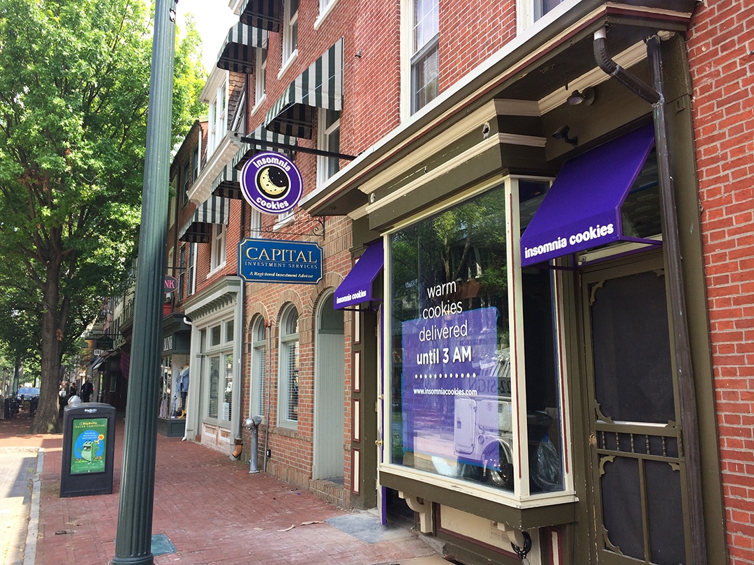
Did you know there’s a psychology to signage? That’s because different generations look for different things in a sign. About 50 percent of Baby Boomers prefer a simplistic design, for example, while the same percentage of Millennials favor contemporary graphics and creativity. And let’s not even get started on those Gen Xers! So when you’re creating your sign, you’ll want to consider your target audience.
Millennial consumers are drawn to a minimalist font.
Things to Keep in Mind When Designing Your Sign
When designing your signage, you’ll want to keep your consumer in the front of you mind and not simply the latest design trends. For example, many Baby Boomers and Millennials feel that too much color is garish on a sign. Both groups believe that a brand can be better marketed with just one or two carefully selected hues. Moreover, the colors shouldn’t be random. Instead, they should fit what is being sold.
Generational Trends for Sign Design
There’s at least one thing that all generation agree on: signs have to be readable. But that’s where it ends. Where Millennials tend toward modern fonts, it’s the more contemporary and italic fonts that get Baby Boomers swooning. The message is clear: when it comes to designing signage, let your consumer be your guide and not the most current design trend fad.
Millennials are also suckers for signs that employ humor, or irony. And younger consumers warm to signs that play boldly with color contrast. This sign design boosts sales in the area of clothing and footwear, along with sporting goods, and restaurants.
If you want to play it safe and cater to a wider audience, simplistic signs perform well as a rule. And remember to consider how your sign blends into the neighborhood, both in style and design, along with overall size and shape.